KAIView Map Update
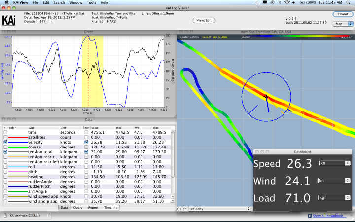
Return to NewsKAIView 0.2.6 contains several improvements from the last few weeks, particularly in the mapping component and its integration with the other data displays. The overall goal has been to make the mapping window more useful as a primary interface to the data, instead of just a supplement to the graph display. By default the map window is now larger, the data that it already displayed is easier to read, and a legend shows the geographic scale and the meaning of the color-coded data.
In addition to these visual changes, there is now better correspondence between selections made in the graph window and those made in the map. Right-clicking and dragging in either view will create a selection that is shown in both views. (Note that the center button was previously used for selecting regions in the graph, but since the button is non-existent or mapped to system functions in OSX, it will be avoided.)
Under the Tools menu is a “Dashboard” option, which brings up a simple, large numeric display of the boat speed, wind speed, and line tension to make it easier to watch just these three values while stepping through a dataset. The dashboard text can be resized with the +/- keys.
In the graph window, certain quantities that we frequently compare to each other now have matched y-axis ranges. This means, for example, that boat speed and wind speed will always be plotted such that they can be directly compared in the graph without having to carefully watch the vertical scale.
Finally, the problem of windows getting “lost” if minimized on OSX has been partly resolved with the addition of the “Layout” button on the top-right corner of the display. This button (along with the selection box below it) resets all windows to either a map-centric or graph-centric arrangement.
Return to NewsMore: Electronics and Software Development

